Illustrations
Contains information required to create consistent brand illustrations for the present and future.
Contents
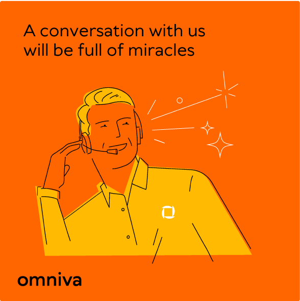
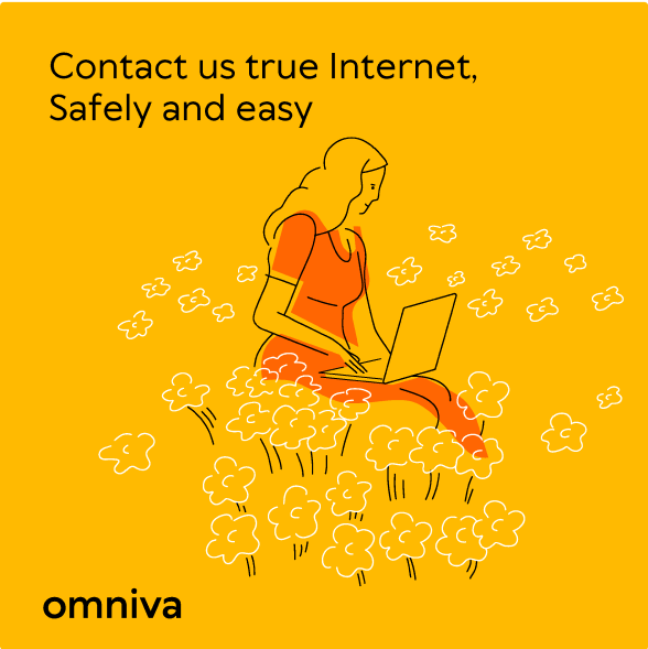
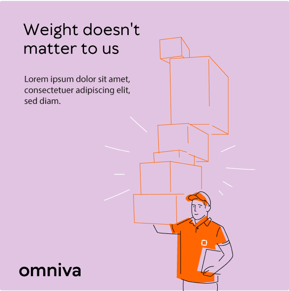
Omniva's illustration style is light, simple and well-balanced between technical drawing and fluid more organic lines. Human faces are stylized to a bare minimum, but retain a sense of emotion. Most times illustrations are without background drawings to emphasize the story of the main character. Illustration should be based on a reference photo.
Here are a few examples of an Omniva courier with a parcel and some office workers. We can't rely on illustration alone to show people and emotions. We recommend mainly using photography to show customers to avoid being seen as a shy or fake brand without real people.

Color style
The colour palette of Omniva illustrations should mostly be drawn with black color lines. If necessary Omniva's primary colour accents can be added to line work. To make the illustration more fun, additional color silhouettes and shapes can be added based on Omniva's colour palette.
The black and white colour palette for line work should be used to make sure that illustrations work on any Omniva color background.
To use Omniva brand colours correctly please read more here

Tools
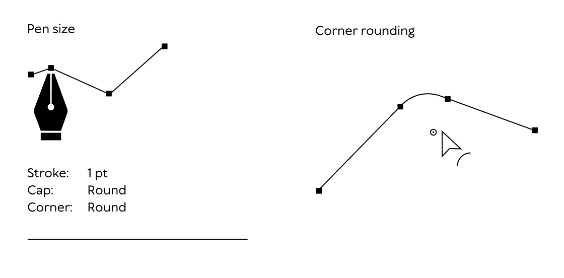
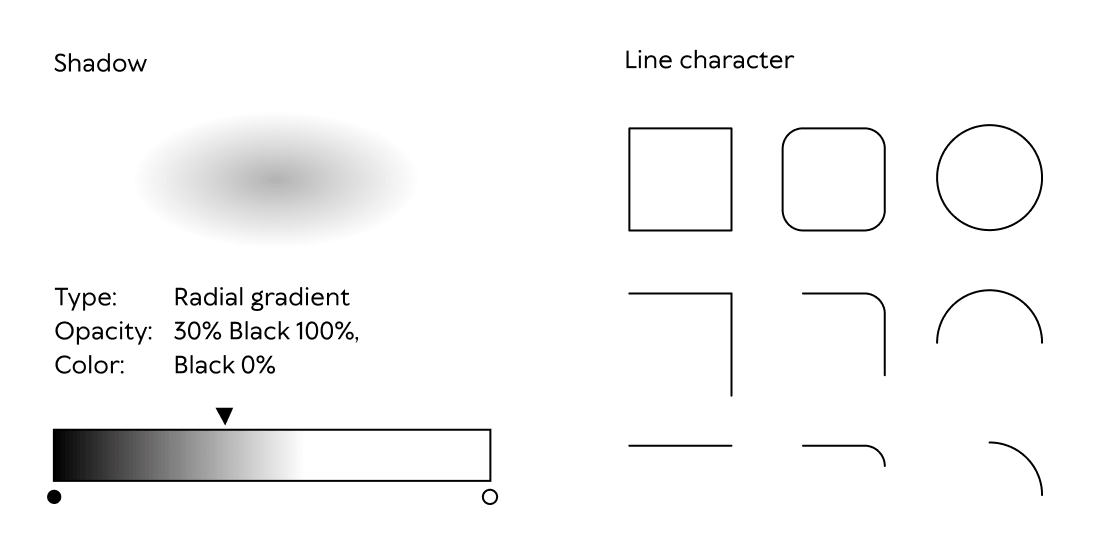
To build an Omniva illustration, you have to work with a pen tool (size 1 pt with round cap and corners) from adobe illustrator software. Round most of the corners to make the illustration look smoother. Put a shadow under the feet of the illustration, made from Radial gradient with black color and Opacity of 30%.
Anatomy
To build an Omniva illustration of a human, you have to work with a pen tool (size 1 pt with round cap and corners) from adobe illustrator software.
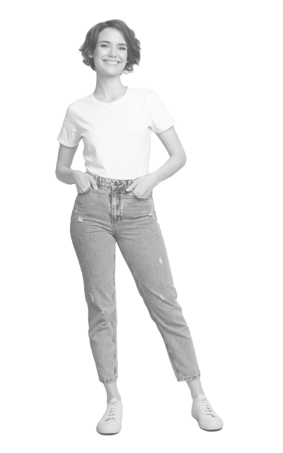
Reference
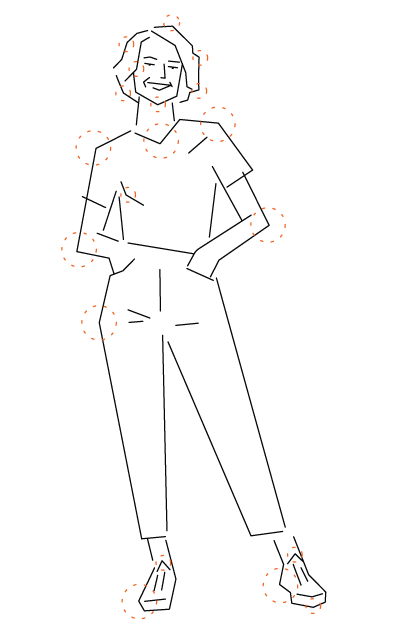
Choose reference photo.
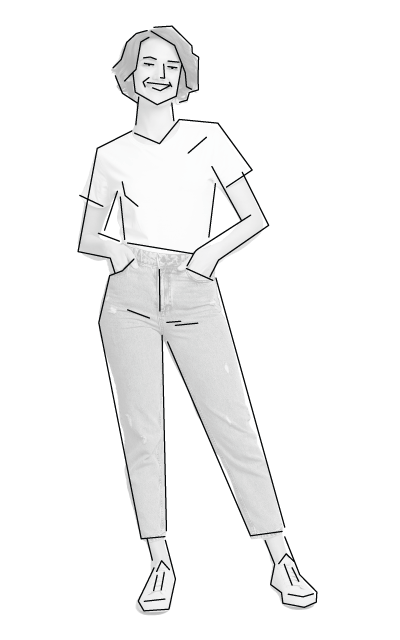
Pen tool work
Choose the point to create lines over the reference photo with a pen tool. Make lines with sharp corners only. Most of the lines must be separated and not connected to the others to make the illustration look looser.
Rounding few corners
Round most of the corners to make the illustration smoother.
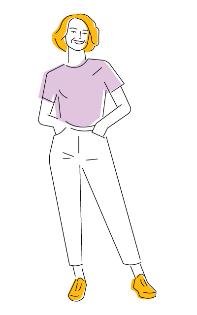
Color shapes
Add collar accent as shapes under line work. Colour shapes should be a bit displaced to give the illustration a looser and freer vibe. Always leave some empty space without color shape.
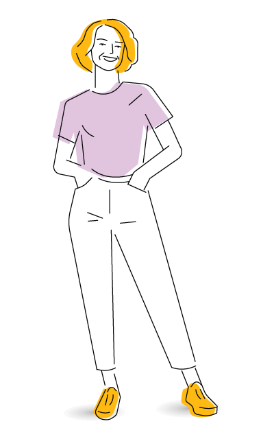
Final illustration
Put a shadow under the feet of the illustration, made from Radial gradient with black color and opacity of 30%.
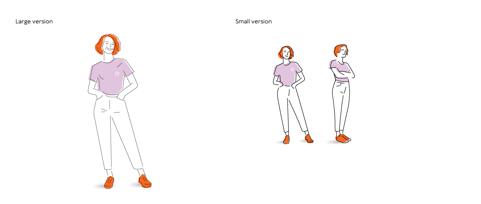
Human proportion
There is a difference between large and small scale human illustration. The smaller version has fewer lines, especially in the facial area to make the illustration less detailed and more perceptible.
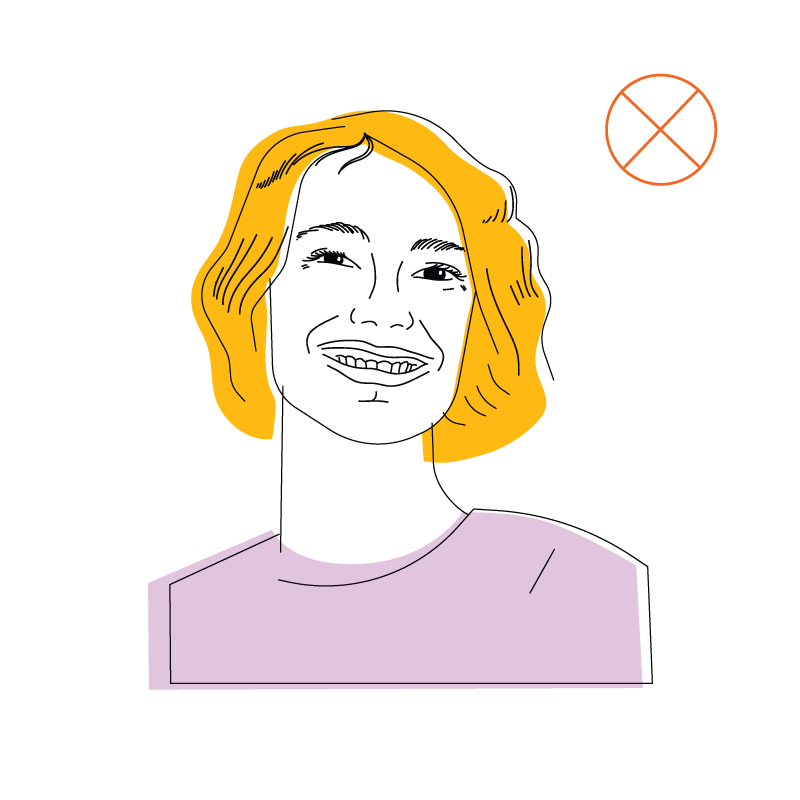
Human portrait
When building the human face, use the simple design shown in the example to depict the eyes, nose and mouth.

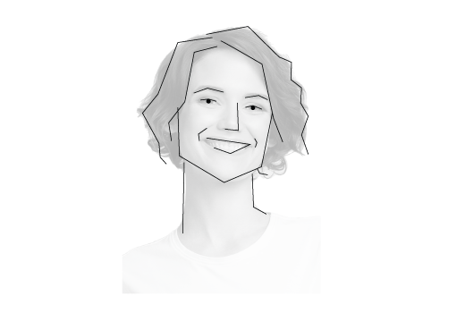
Reference
Choose reference photo.
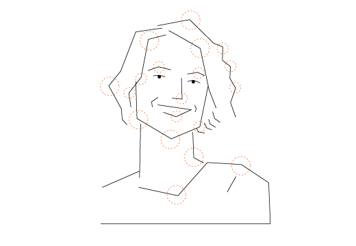
Pen tool work
Choose the point to create lines over the reference photo with a pen tool. Make lines only with sharp corners. Most lines must be separate and not connected to others to make the illustration look looser.
Rounding few corners
Round most of the corners to make the illustration look smoother.
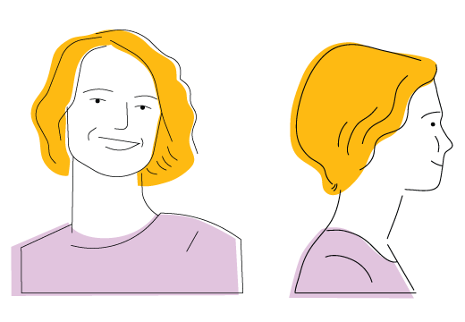
Final illustration
Front and side view.
Add collar accent as shapes under line work.
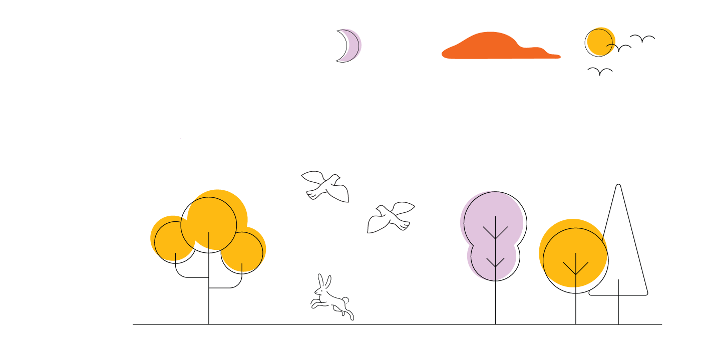
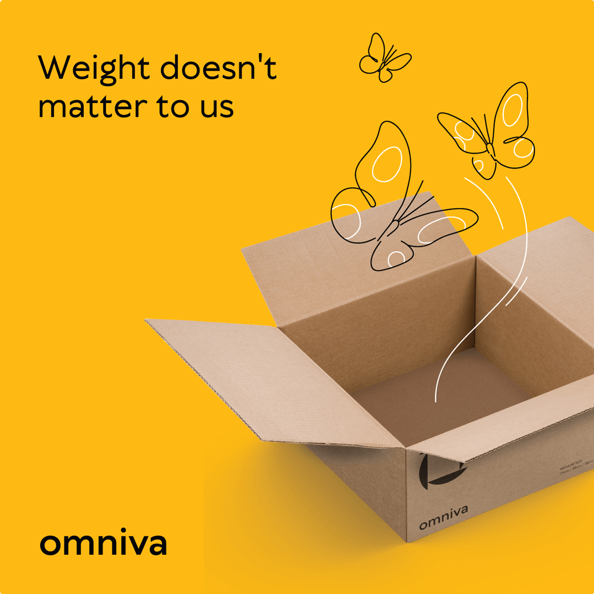
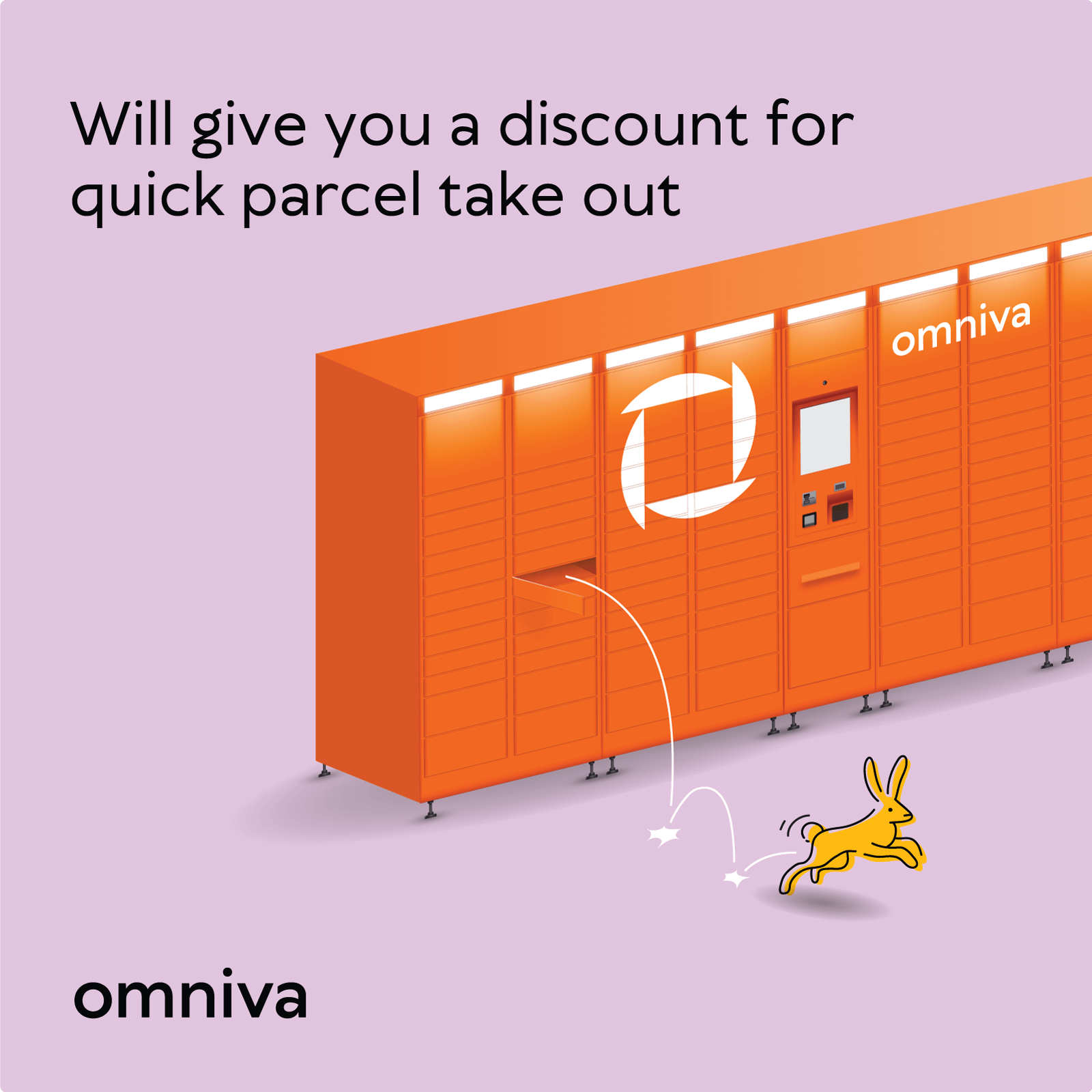
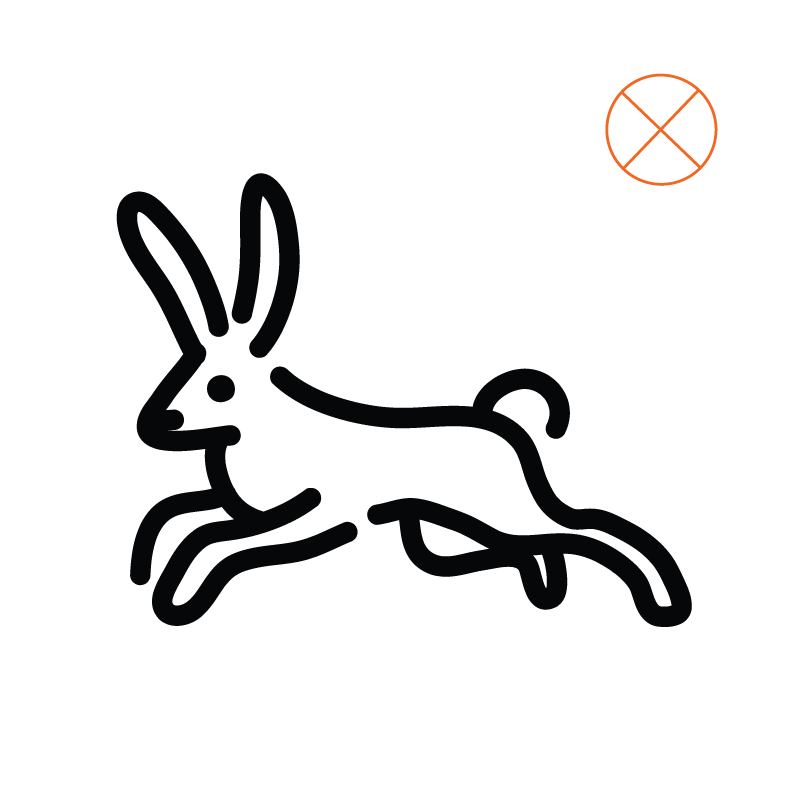
Elements
Some random element for more fun illustration.
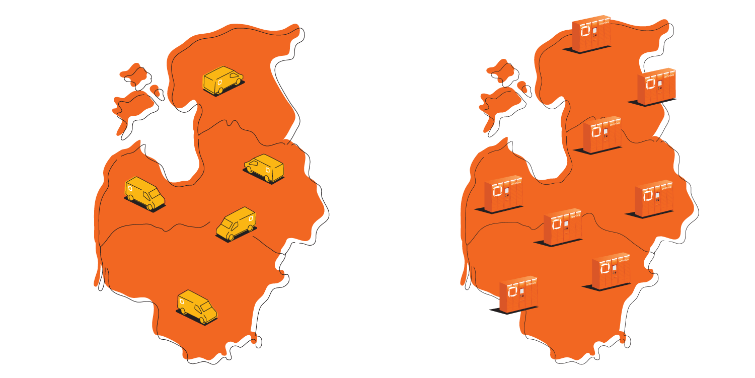
Maps
Some library of maps.
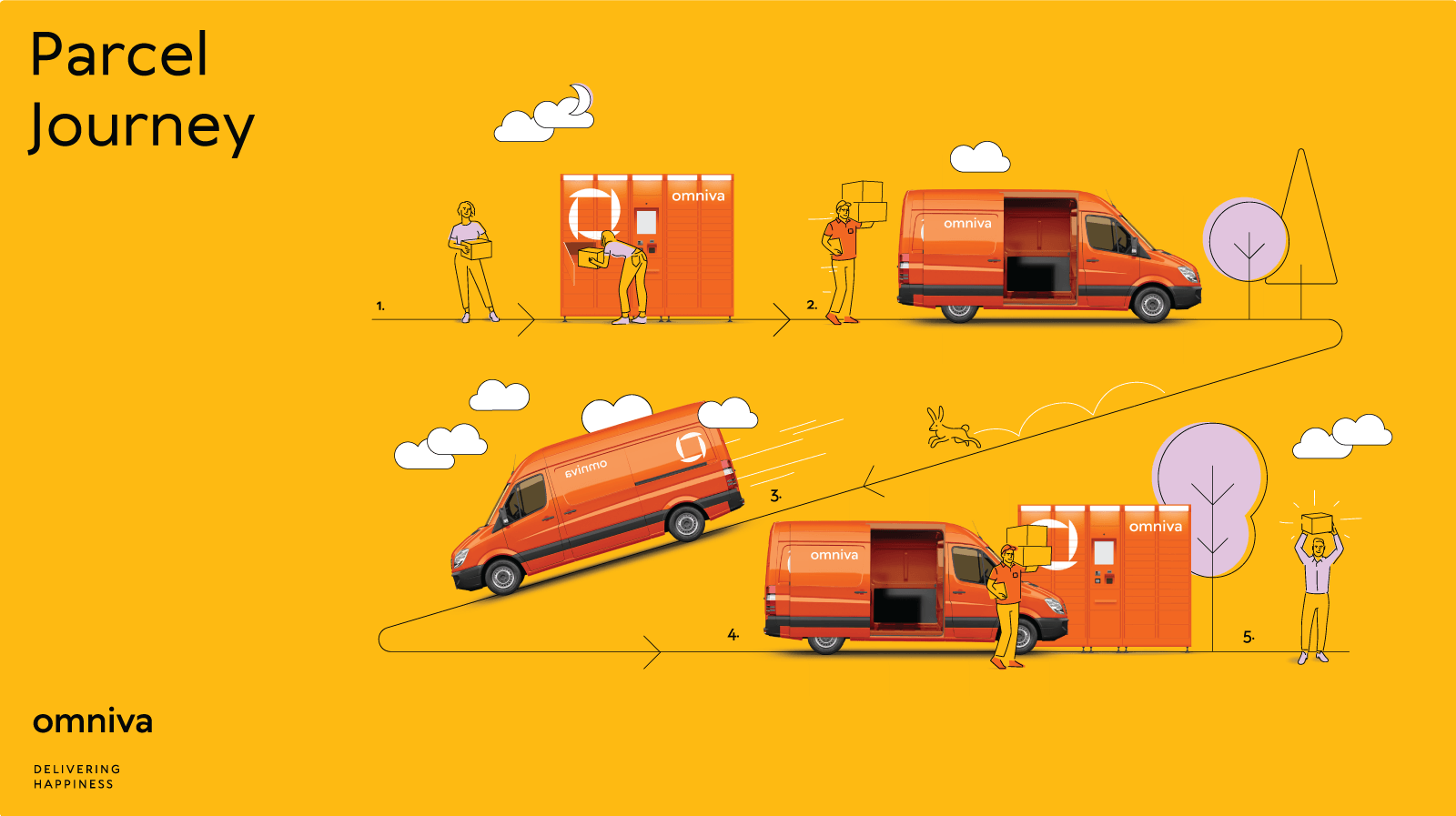
Usage
Use illustration when the idea cannot be expressed with photography. To dilute the material from too much photography and keep it visually expressive. When subtle attention is required (photography draws more attention).
Frequency of usage in social media - illustrations are not more than 30% of the content. Photography and illustrations should not be used in one post or other item. In presentations, leaflets and other materials divided into parts/slides - either photography or illustration are used and not both in one part/slide.
Dont's
Dont’s of Omniva illustration style.

Don't use artistic line effect at all (as chalk, watercolor ...)
Don't use detail line work. It makes everything look busy and complicated.
Don't use detail line work.