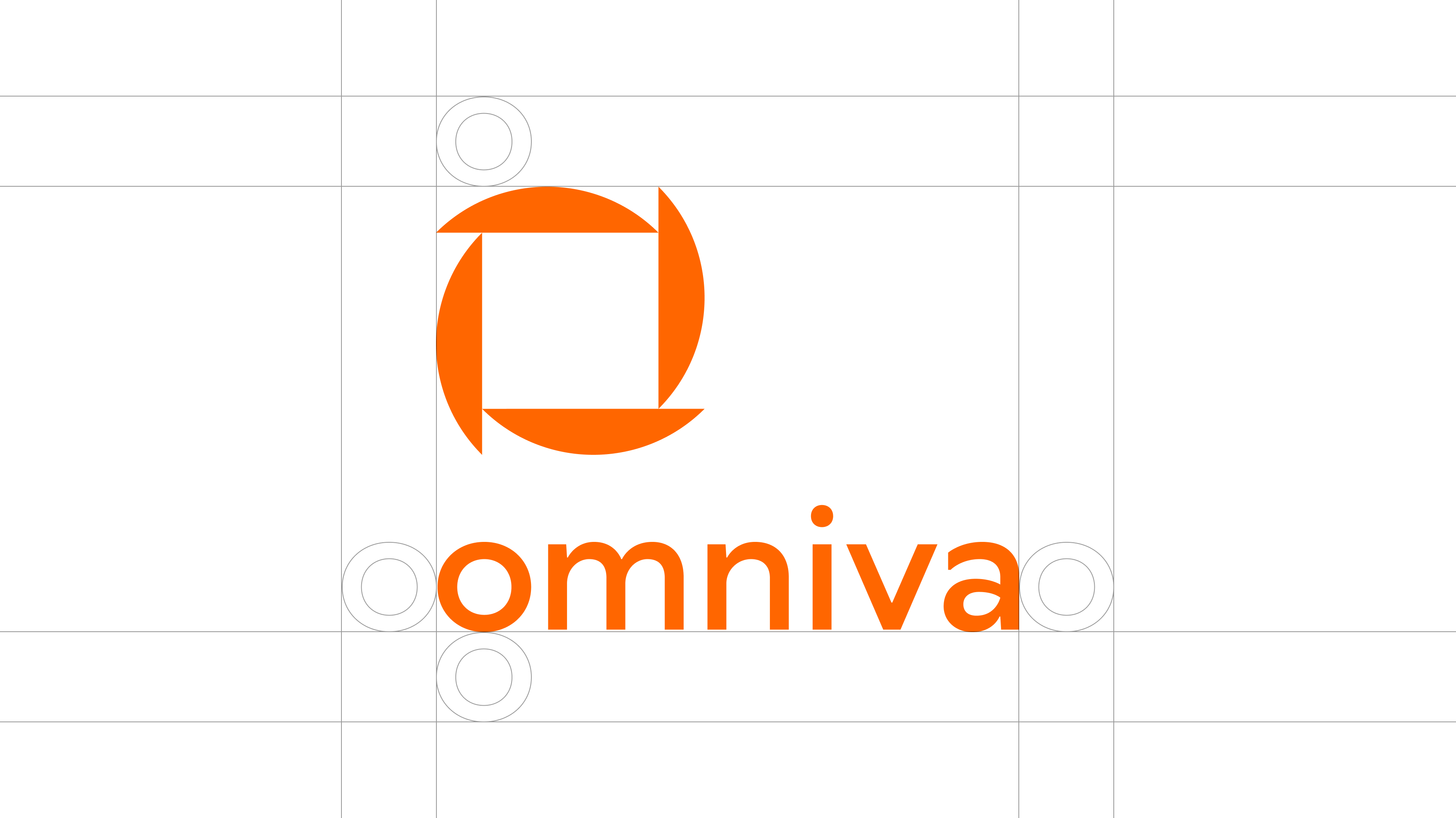
Logo
Recommendations for logo use in variety of different mediums.
Symbol
Omniva symbol is made from a shape that is repeated four times and forms a distinctive symbol with a square in the middle. The shape symbolizes movement and happiness. It works well both in large and small sizes as well in digital and print.
 Download in .png
Orange on white background
On deep black background
Black on white background
Wordmark
Omniva wordmark is based on a friendly and geometric sans-serif, the same typeface as the whole brand identity – TT Wellingtons. It still honors the previous brand identity by maintaining the lowercase letter "o".

On orange background
On deep black background

On berry purple background
Wordmark with slogan
Wordmark is based on a friendly and geometric sans-serif. It is based on the same typeface, as the whole brand identity – TT Wellingtons. It still honors the previous brand identity by maintaining the lowercase letter "o".

Wordmark with slogan in English on orange background

Wordmark with slogan in Lithuanian on berry purple background

Wordmark with slogan in Estonian on deep black background

Wordmark with slogan in Latvian on yellow background
Lockup
Lockup may be used for extra recognition. Depending on the use horizontal or vertical lockup is available in all key brand colours.

On orange background

On berry purple background

On white background

On deep black background
Color use for logo
Our brand is about shining precision therefore correct but playful use of colour is welcomed. Here are the colour combinations that would work for best logo perception and readability. Brave but respectful is the attitude towards use of colour of Omniva logo.
Color combinations
Orange
Deep black
Orange
Sun yellow
Berry purple
Monochrome colors

Black
White
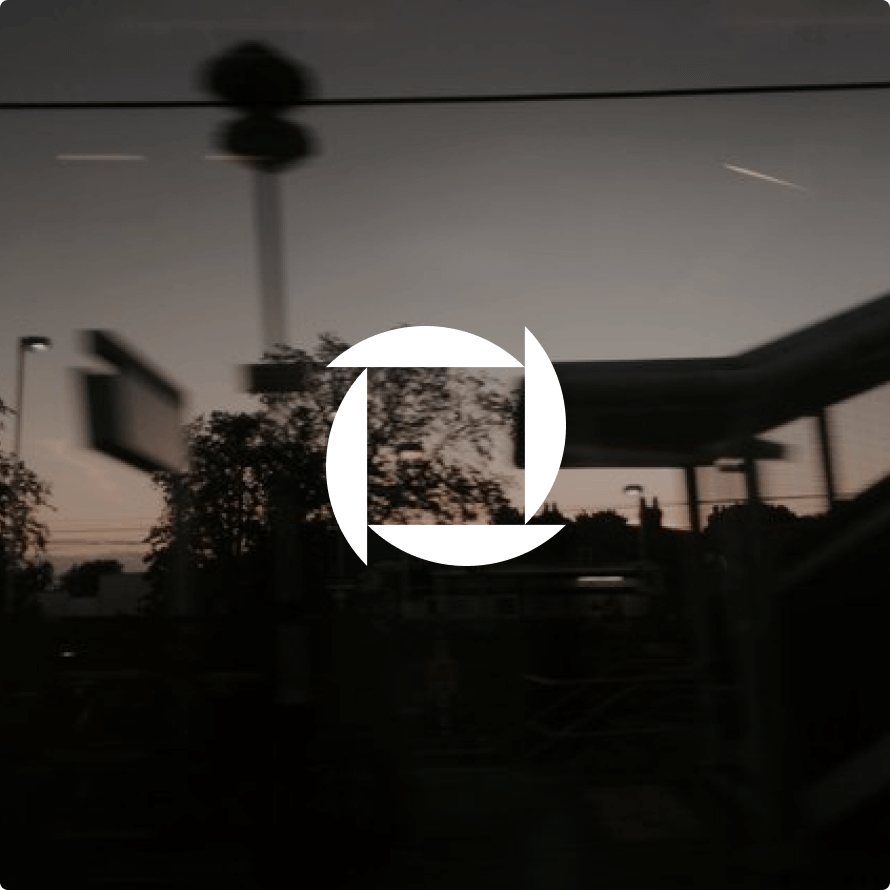
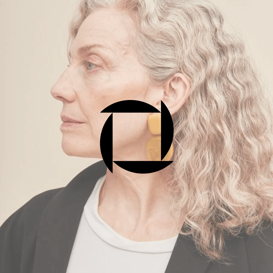
In conjunction with photography
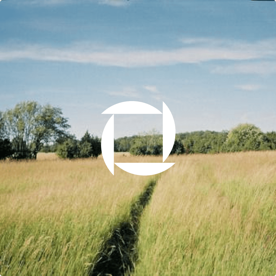
When image is light and bright, use logo versions set in White color for best visibility

When image is light and bright, use logo versions set in Deep Black color for best visibility
When image isn't dark enough for good visibility add overlay in Deep Black (around 30% opacity)
When image isn't light enough for good visibility add overlayin White (around 30% opacity)
Safety zone
To ensure that your logo looks best, avoid adding other graphic elements to your logo in the safety zone. Safety zone is quite simple - letter O on all sides, you gain sufficient free space around your content.
Lockup safety zone
Omniva symbol safety zone
Omniva wordmark with slogan safety zone
Minimal size
To ensure that logo is always legible, these are the smallest possible sizings of your logo versions. Digital and printed mediums sizes are shown below.

Incorrect use of logo
We would advise to avoid using logo in these types of situations. This will ensure that brand logo stays consistent and true to the brand identity.
Avoid
Avoid non-proportional stretching
Avoid
Avoid creating new lockup combinations
Avoid
Avoid adding curves or imitating brand pattern with logo
Avoid
Avoid adding curves or imitating brand pattern with logo
Avoid
Avoid using positions that aren’t in 90° angles
Avoid
Avoid drop shadows, even if they’re subtle
Avoid
Avoid using outlined logo versions
Avoid
Alwayse use only the defined logo colors
Avoid
Avoid using logo as a mask for photos